We have nearly finished editing our music video, here is what we have done so far.
Friday, 10 December 2010
Friday, 3 December 2010
Rough Cut
We are about half way through editing so far. We are hopefully going to finish filming next week as there is a dance show in the drama department at the moment so we can't get in there to continue with that. There are lots of gaps as they are going to be filled with footage we still have to shoot.
Split Screen
Here is what I made when I was practising using different split screens.
Here are two screen shots to illustrate the editing I was doing
Wednesday, 1 December 2010
Split Screen Test
Since Kim had tried out the new effect Split Screen, I also decided it would be a good idea for me to become familiar with this sort of edit.
On Premiere Elements, I took 3 clips; One feet shot, one Mid Shot and One head shot.
I then proceeded to use the Crop tool to cut down the clips to get the parts that i wanted of the clip and to focus more on that part.
I then layered the clips on top of eachother so that when the clip was played, all 3 parts played at the same time on top of one another.
When we eventually get to film again, I think we need to get the shots for this kind of edit to be in to correct position as none of the clips fit together, size wise and it looks a little silly. We need to consider this for the next time we film.
Here is a screen shot of me playing around with the new effects on Premiere Elements.
Here is a quick clip that I made playing with the cropping tool.
Tuesday, 30 November 2010
Practising Split Screen
Today I have been practicing editing for the split screen parts of our music video. It is quite difficult to judge the amounts that I should clip out of each shot but I am going to spend the rest of this lesson practicing. Here is another example of a already existing music video that has inspired me to include split screen in our video.
Thursday, 25 November 2010
Further Editing
Due to a drama exam taking place throughout this week, Kim and I have been finding it very difficult to get in enough time to edit and also to film the remaining footage we need to complete our music video.
We are planning to do this next week when our exam will be finished.
We are planning to do this next week when our exam will be finished.
Wednesday, 24 November 2010
Continuing Editing
In order to get the editing finished as quickly as possible, I have been doing as much of it as possible in my free periods. Although it takes a while to clip all of the shots so that they are in time with the words, I am enjoying doing it.
Here you can see that I have been editing all of the footage of Rob.
I think we are going to have to plan another filming session in which we will get some shots of more people, because we have already used a lot of the footage we took last week and there is still 1 minute and 50 seconds to go of the song.
Tuesday, 23 November 2010
Editing
Now that we have sorted out the song, Lisa and I have began editing the footage. We have to arrange it all so that it fits in time with the music. We have decided that since we already have lots of dancing shots that we no longer need to include the dancing shots in which Lisa and I are painted black and white, as they would just be a repeat of the dancing shots we already have.
Thursday, 18 November 2010
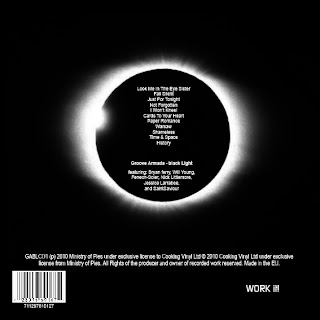
Groove Armada Digipack
Studying Digipacks, I have been looking at one album called Black Light by Groove Armada.
In an attempt to make myself more familiar with the process of creating my own digipack and also to help inspire ideas for my one, I made a replica of this album.
I did as much as possible to make my version look as close to the real thing as possible.
In an attempt to make myself more familiar with the process of creating my own digipack and also to help inspire ideas for my one, I made a replica of this album.
Todays Lesson
Today in the lesson, Kim and I both had a turn at editing our song in appropriate places as the original song is 4 minutes and 30 seconds, which is definitely too long for us to create our music video to.
We have cut the song down successfully in order to proceed with our editing, to put our clips with our music accordingly.
Wednesday, 17 November 2010
Finally Filming
Last night Lisa and I re-started filming. We had a number of our actors with us so we got quite a lot done, and there was a chilled and relaxed atmosphere which made it a really fun and enjoyable hour. All of the actors were also extremely co-operative and weren't shy about doing anything we asked them to do; as a result the time passed extremely quickly.
This time I ensured that the black background and floor covers were much bigger than last time, and also that they were taught so you couldn't see any creases in the material. As well as that, we used the floor lights again but so that they were much brighter this time. Here are a couple of clips of footage we took.
This time I ensured that the black background and floor covers were much bigger than last time, and also that they were taught so you couldn't see any creases in the material. As well as that, we used the floor lights again but so that they were much brighter this time. Here are a couple of clips of footage we took.
Tuesday, 16 November 2010
What I Did Wrong
Here is a video of some of the footage I shot last week and a description of what is wrong and why
Forward Planning
Due to medical issues, and problems with finding appropriate times to film in our chosen space, our filming process is taking longer than expected.
I have emailed our entire cast to come up this evening so we can get together as much footage as possible, and then we will take people individually for re-shooting if needed.
I have emailed our entire cast to come up this evening so we can get together as much footage as possible, and then we will take people individually for re-shooting if needed.
Friday, 12 November 2010
Started Filming
Last night I filmed parts of our film; mainly four of the five stereotypical characters parts. I have uploaded it onto the computer and after re-watching all of the footage I had realised that the lighting was far too dark, and also the backdrop was too small and it looks unprofessional.
Also, the camera I was using took a long time to focus, and since the lighting wasn't very good it took even longer than usual to focus on whoever was in the shot. I'm therefore going to use a different camera with a better focus next time I'm filming.
The sheets I put up to use as the backgrounds weren't big enough and it looks unprofessional in the footage so next time I will make sure that they are bigger so you can't see anything around the edges of them.
Although I doubt we will use any of the footage I took, it was a beneficial learning curve as I have learnt that when filming indoors there needs to be much more lighting than what would be used then when filming elsewhere.
I am going to talk to Lisa to see what we can do and see what changes we can make it make it look better from an audience perspective.
Wednesday, 10 November 2010
Filming Times
Lisa and I have found it difficult to find times that we are both free in order for us to film due to our hectic school schedule.
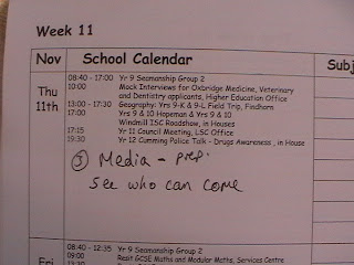
So far we have not managed to keep with any of the times we planned before half term so we need to start filming as soon as possible.
All of our raw footage needs to of been filmed by the 20th of November which is only 10 days from now. so we really need to get cracking.

During class today we need to sit down and decide some deffinate times that we are going to dedicate to filming.
Tuesday, 9 November 2010
Song Purachse
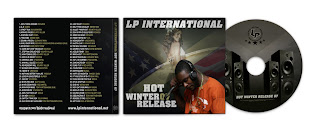
The first compact disk (CD) came out in the mid 1980s but sales didn't start to pick up until the early 1990s.
In 2001 iTunes was released and as a result internet sales started increasing and CD purchase decreased.
 |
| A typical CD came with a cover, CD and little booklet about the artist |
In 2010, Cd's have been largely replaced by other forms of digital storage such as flash drives and as a result audio CD sales have dropped by nearly 50% from their peak in 2000. As well as iTunes, to date there are so many different websites on the internet that enable anyone to buy a song or an album and download it straight onto a computer instead of having to do so from a CD.
 |
| The online iTunes website is one of the many ways people nowadays download music |
With the invention of online purchase comes the possibility of piracy, but since nowadays its possible to access in order to buy any artist music online it is a necessity for them to have their work easily available.
Star Images
Star images are used for helping to promote an album, CD or digipack. It helps the cover look much more aesthetically pleasing, and also shows you who the artist is.
The star image is sometimes used as the front cover of the digipack, but if this is done, it must be the best picture out of the whole reel of shots taken.
The photograph must also link in somehow with either the album name or the song name.
FOR EXAMPLE:
Mika's album is called - Life in Cartoon Motion.
If you look at the cover of the album, the artwork has all been done in a cartoon style and the colours and style definately all link in together. There is also a smaller picture of the artist on the cover too.
Rihanna's album is called 'Rated R' which actually already links in with her name as they both begin with the same letter. The album is a darker style of music in comparison to her previous albums, so in order to shed light on this, the cover photograph and the complete digipack style has been altered to fit this new style of the artist.
In conclusion, I think that our photographs must link in with our music video, which I think will eventually include a collage almost of photographs of all of the people in our music video, but also use a photograph of the original artist, The Black Eyed Peas, in order to credit them for the song, due to copyrights.
Friday, 5 November 2010
Stop Motion Final
Today Lisa and I have taken the pictures for the stop motion that will appear in our music video. In order to stop any of the pictures from going squint we taped down the paper to the floor. In the next couple of days we are going to start filming our footage.
Further Digipack Research
Looking further into the non-artist matter, here are a couple of music videos I found which are relevant to ours, which do not actually use the artist in the videos, and instead use actors or other random people.
This is the reason that our artist will not have a big effect on our Digipack, but credits will be given.
This is the reason that our artist will not have a big effect on our Digipack, but credits will be given.
DigiPack Research
I have been researching different Digipacks today, trying to find different examples and also to use these as inspiration for our own Digipack for our music video.
As most of the Digipacks I found were actually for albums, we have decided to create ours in a different style. As we obviously do not have the artist present in our video, and we have many ideas of our own for the Digipack, we will pretend we are making it as the producers, but remember to add credits to the artist and possibly add a little leaflet inside our pack.
This will give us more freedom to create the Digipack in a more personal way and also so we can put our distribution company on it.
Here are the Digipacks I have found today, and liked.
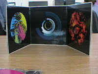
I like this first one as the pictures are interesting and colourful. It is the correct size that ours will be and there is no writing which makes it more aesthetically pleasing.
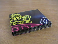
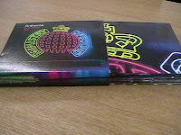
This is a 8 panelled case, and is also very colourful. I really like the style and simplicity, but I want to use a bit more detail on our Digipack.
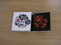
This one is very interesting as the pack's background pictures fit in with the actual design on the discs. It looks like speakers when sitting like this and it is very aesthetically pleasing.
As most of the Digipacks I found were actually for albums, we have decided to create ours in a different style. As we obviously do not have the artist present in our video, and we have many ideas of our own for the Digipack, we will pretend we are making it as the producers, but remember to add credits to the artist and possibly add a little leaflet inside our pack.
This will give us more freedom to create the Digipack in a more personal way and also so we can put our distribution company on it.
Here are the Digipacks I have found today, and liked.

I like this first one as the pictures are interesting and colourful. It is the correct size that ours will be and there is no writing which makes it more aesthetically pleasing.


This is a 8 panelled case, and is also very colourful. I really like the style and simplicity, but I want to use a bit more detail on our Digipack.

This one is very interesting as the pack's background pictures fit in with the actual design on the discs. It looks like speakers when sitting like this and it is very aesthetically pleasing.
Practice Fonts
For our coursework DigiPack, Kim and I decided to keep our original font which we used in our title on our Blog page. We think it looks nice against our title and suits it well.
Here is our first try at the front cover.Tuesday, 19 October 2010
Ready To Begin Filming
We are now completely up to date with everything that needs to of been completed and are ready to begin filming our video. We will start this as soon as we come back to school after the half term break, and are both really excited about the prospect of filming.
Planning Props and Costumes
For our music video, we will need certain props and different costumes for different people.
All together, we will have 23 different people in our music video.
I will go through each character, list their costume and the props they will need.
1. Robyn - Dress & Heels - Hair dryer, make-up, hairbrush.
2. Rob - Smart jeans, Polo shirt and CLEAN shoes - Weights
3. Koko - Basketball shorts + shirt & High-tops - Basketball
4. Ali Baxter - Trackies, Polo shirt & Trainers
5. Cristina - Sweatpants, Vest top, Jacket & High-tops - Cap
6. Lisa - Black leggings, Black vest top, Black socks - Black paint
7. Kim - White leggings, White vest top, White socks - White paint
8. Vidur - Casual
9. Ahmed - Casual
10. Simon - Casual
11. Jamie - Casual
12. Imogen - Casual
13. Dolphin - Casual
14. Corrina - Casual
15. Cat - Casual
16. Phoebe - Casual
17. Mikey - Casual
18. Henri - Casual
19. Lauren - Casual
20. Tom - Casual
21. Doug - Casual
22. Millie - Casual
23. Callum P - Casual
EXTRA THINGS WE WILL NEED :
-Floor lighting for dancing scenes
-White Backdrop
-Black Backdrop
More Audience Research
To expand the knowledge I have of perspective audiences in real-life situations, I looked at the Channel 4 website, who actually give realistic facts and figures about the public and what kind of thing they want to see in music videos and on T.V.
This was a very good taster of what kind of audience we would most likely be targeting.
Here is a screenshot of a page on the 4Music page, which was extremely helpful to the research and also to give us more of an idea of what we wanted to do and focus on whilst completing our task.
This was a very good taster of what kind of audience we would most likely be targeting.
Here is a screenshot of a page on the 4Music page, which was extremely helpful to the research and also to give us more of an idea of what we wanted to do and focus on whilst completing our task.
Friday, 15 October 2010
Make-up Tests
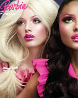
In regards to the make up of the two main girl characters who will be respresenting two different styles, Cristina and Robyn, I have managed to do two little make-up tests.
For Cristina's street style, I felt that a more smokey, dark coloured effect on her eyes would be most effective.
Looking at different picture on the internet and from fashion magazines, this is the look we desired, and the look we ended up with.
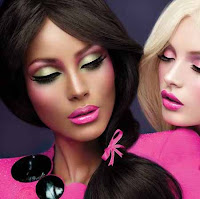
For Cristina's street style, I felt that a more smokey, dark coloured effect on her eyes would be most effective.
Looking at different picture on the internet and from fashion magazines, this is the look we desired, and the look we ended up with.
For Robyn's make up however, we decided to go for a more girly 'Barbie' kind of look with lots of pinks and more subtle colours which definately help to enhance the girly style even just within the make up.
Here were some inspirations from the newest MAC collection, which is called 'Barbie loves MAC'.


Andrew Goodwin's Theory
Andrew Goodwin has identified a number of key features which distinguish a music video as a form:
Voyeurism often plays a major part and is present in many music videos, especially in the treatment of females, but also in terms of systems of looking. Some examples are screens within screens, cameras, mirrors, etc.
He says that music videos are often constructed by the link between the visuals and the song plus the artist. Relationships are built between these in the video, and the close-ups of the artists gives them the representation and publicity they require. Voyeurism is used to increase the video’s attractiveness, particularly to males, whilst intertextuality is often employed in humorous videos.
Many of these features are present in all music videos, depending on the genre of the song and the aim of the record company/artist.
There is often intertextual reference:
There are likely to be intertextual references to other media texts, either to other music videos or to films and TV texts, these provide further gratification and pleasure for the viewers/fans.
This video is not specifially referencing towards any particular music video, or film. However it is referencing to a common theme within many films and other songs based on being care free and happy.
Voyeurism often plays a major part and is present in many music videos, especially in the treatment of females, but also in terms of systems of looking. Some examples are screens within screens, cameras, mirrors, etc.
He says that music videos are often constructed by the link between the visuals and the song plus the artist. Relationships are built between these in the video, and the close-ups of the artists gives them the representation and publicity they require. Voyeurism is used to increase the video’s attractiveness, particularly to males, whilst intertextuality is often employed in humorous videos.
Many of these features are present in all music videos, depending on the genre of the song and the aim of the record company/artist.
Music videos demonstrate genre characteristics:
Genres are complex and diverse in terms of music video related style, and iconography - Record companies will demand a lot of close-ups of the main artist or vocalist.
Black Eyed Peas are a pop and R’n’B band and therefore all of their videos contain the typical characteristics for a video of these genres. They generally contain lots of happy people and a clear storyline. We are going to replicate each of these different things as much as possible, without copying the original video.
Most pop videos have the same sorts of sounds; a ‘bouncy’ tune usually about love and although we are using a song with this stereotypical image we are changing the content to make contrary to what would be expected.
Another characteristic is a close-up shot of the artist singing into the camera with either things going on behind them or not, and we are going to do this in our video as we feel it is a necessity.
There is a relationship between lyrics and visuals:
There is a relationship between the lyrics and the visuals, with the visuals illustrating, amplifying or contradicting the lyrics.
The lyrics in the song ‘I Gotta Feeling’ narrate the action of the song – during the line of the chorus ‘I gotta feeling that tonights gonna be a good night’ you see people either getting ready or dancing and smiling.
There is a relationship between music and visuals:
There is a relationship between the music and the visuals, with the visuals illustrating, amplifying or contradicting the music.
For the rhythm of a music video to flow well it is necessary that the music and the visuals fit well together. When songs have a strong, fast beat throughout the editing is usually quick paced and the shots are of a short length.
This song has a fast beat throughout and therefore to fit with the upbeat music all of the shots are quickly edited together. This illustrates the light-hearted meaning the song is representing.
There is often intertextual reference:
There are likely to be intertextual references to other media texts, either to other music videos or to films and TV texts, these provide further gratification and pleasure for the viewers/fans.
This video is not specifially referencing towards any particular music video, or film. However it is referencing to a common theme within many films and other songs based on being care free and happy.
 |
| Here is a mind map I made about all of these different points |
Risk Assessment
Before we began to film, it was essential to complete a Risk Assessment form to acknowledge the fact that there may be some potential hazards whilst filming our music video, and to keep us completely aware of the actions that would be undertaken if the events happened to occur.
Tuesday, 12 October 2010
Practice Painting!!
Kim and I have several ideas integrated into our music video and one of those is actually involving us. We are going to be dancers in our video and our idea was to have two complete contrasts.
Kim will be painted white, wearing all white clothing and will be dancing against a black background and I will do the complete opposite. Black body paint and clothing dancing against a white background.
To practise this, we went to the art department today and did a sample of paint on each of our arms to see what the effect would be.
We both really thought the outcome was interesting and different which was the look we were going for.
Here is a video that we made documenting our practise:
Stereotypical Characters
I have been looking for the types of costumes that each of our main characters will be wearing. We want them to be the 5 different stereotypical groups.
1) Chav - We want our chav to be wearing an addidas zip up jumper, brand new trainers so that they are as white as possible and white socks with tackies tucked into them.
2) Girly - We want the girly girl to be wearing lots of pink and to be constantly be smiling to come across as happy and care free.
3) Hip hop - We want our hip hop person to be represent a basketball player - wearing baggy shorts and t shirt, with a basketball bouncing it.
4) Lad - We want our lad to be using weights to show that he cares about his image. Also he's going to be wearing a tight fitting t shirt and some blue jeans to show that he wants to come across as though he isn't really trying but in actual fact he is.
5) Street - We want the street girl to be dressed like a break dancer wearing baggy jeans and hi-top trainers.
Friday, 8 October 2010
Animatic Video
Here is our animatic video accompanied with our chosen song. Lisa and I are pictured as the 5 main characters and we have posed in the way of what we want each different actor to be doing. We have also used the members of our class whom are going to be in the video as well for the 'dancing' pictures.
Shot List
This is our shot list so far of the actual shot we have decided on for the beginning of our music video.
1. Clock ticking.
2. Robyns shoes
3. Robs weights
4. Koko's ball
5. Ali's trackies
6. Cristina's hat
7. Stop motion shots 4 seconds
8. Robyn make-up
9. Rob Belt
10. Koko basketball
11. Ali socks
12. Cristina jacket
13. Person 1 dancing
14. Person 2 dancing
15. Person 3 dancing
16. Person 4 dancing
17. Person 5 dancing
18. Stop motion shots 4 seconds
19. Person 6 lyrics
20. Person 7 lyrics
21. Person 8 lyrics
22. Person 9 lyrics
23. Person 10 lyrics
24. Split screen dancing
25. Stop motion shots 4 seconds
26.
** TO BE CONTINUED**
Story Arc Shots
Kim and I have settled on 4 different arcs for our video, each different to maintain interest throughout the video by keeping editing fast and using a varied range of shots.
Section by section, I have drawn the kind of shots that we wish to use on a Post-It storyboard and this is what I came up with.
Section by section, I have drawn the kind of shots that we wish to use on a Post-It storyboard and this is what I came up with.
Thursday, 7 October 2010
Film Casting
In our film, our idea was to involve as many different kinds of people as possible to keep interest in the video throughout.
We wanted to ask as many people as possible, so that even if their shots weren't the best ones, we still had a large selection to choose from. Better to have more than too little.
The people we have chosen to be in our video are people who have vibrant personalities and are not camera shy. The effect we want the video to have is that everyone is happy and having fun and I don't think this would be possible to portray if the cast were not comfortable in front of the camera.
' I gotta Feeling '
Starring:
We have decided to use a lot of different people because enables us to include lots of quick shots of the people and fast editing. Also we are using people with different hair colours as well as skin colours because this adds variety and a difference between one shot from the next.
We want to use a lot of 3 or more split screen shots so using lots of different people will add interest because we want to use 3 different people in each shot - one persons head, one persons middle and another persons feet and legs.
**To be Continued...**
Subscribe to:
Comments (Atom)
